%20(1).png)
March 9, 2020
Top 3 best practices for dashboard design
%20(1).png)
An increasing number of organisations are adopting self-service BI, leading to the production of more reports and dashboards. Unfortunately, this often equates to a lack of governance and data literacy. Many people creating these reports and dashboards often have little formal training in the analytics space, leading to an abundance of visualisation artefacts that don’t adhere to some of the fundamental dashboard design best practices.
Everyone's creating dashboards!
The ability to leverage data and use analytics tools to produce valuable insights is no longer a skill set that only people with analytics and marketing backgrounds have. With intuitive analytics tools such as Power BI, Tableau and MicroStrategy, coupled with high demand for data and low supply of in-house analytics capabilities, the rapid shift to self-service BI has happened.
In this blog, I’m won't explain the whys/why nots of whether this trend is positive or negative – although that sounds like a great topic for another time; Instead, I’ll provide my top 3 dashboard design best practices to consider before designing and creating your dashboard.
#1- Know Your Target Audience
The first question before even starting on the design of a dashboard is:
Who is this dashboard being built for?
Some examples:
C-Level Executives – “What Is Happening?”
Execs use dashboards to monitor what is happening e.g. projected monthly sales forecasting. If there are questions on sales numbers, they usually ask sales & marketing to do some more in-depth analysis. A high-level executive dashboard with KPIs and little/no interaction capabilities would be a good approach.
Sales and Marketing – “Why Are Things Happening?”
Sales and Marketing want to explain why things are happening in regards to sales forecasting numbers being on target or not. They need to conduct exploratory analysis on the data at a lower grain, which is what KPIs are based on.
As you can see, these are two completely different audiences who want to view insights from a different granularity perspective. In the visual examples below, you can see how these dashboards might look.
Take a look at the dashboard images below:
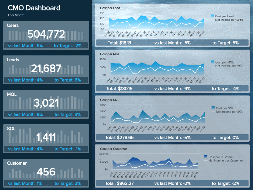
A: C-Level Executives
The dashboard helps to understand “what things are happening”:
- High-level KPIs and trend visuals can be easily read and interpreted quickly.
- Comparisons can be done by reviewing the current results, last month results, and targets from a high level.
- No interactivity via filters as it's primarily for analysis.
Source: Datapine
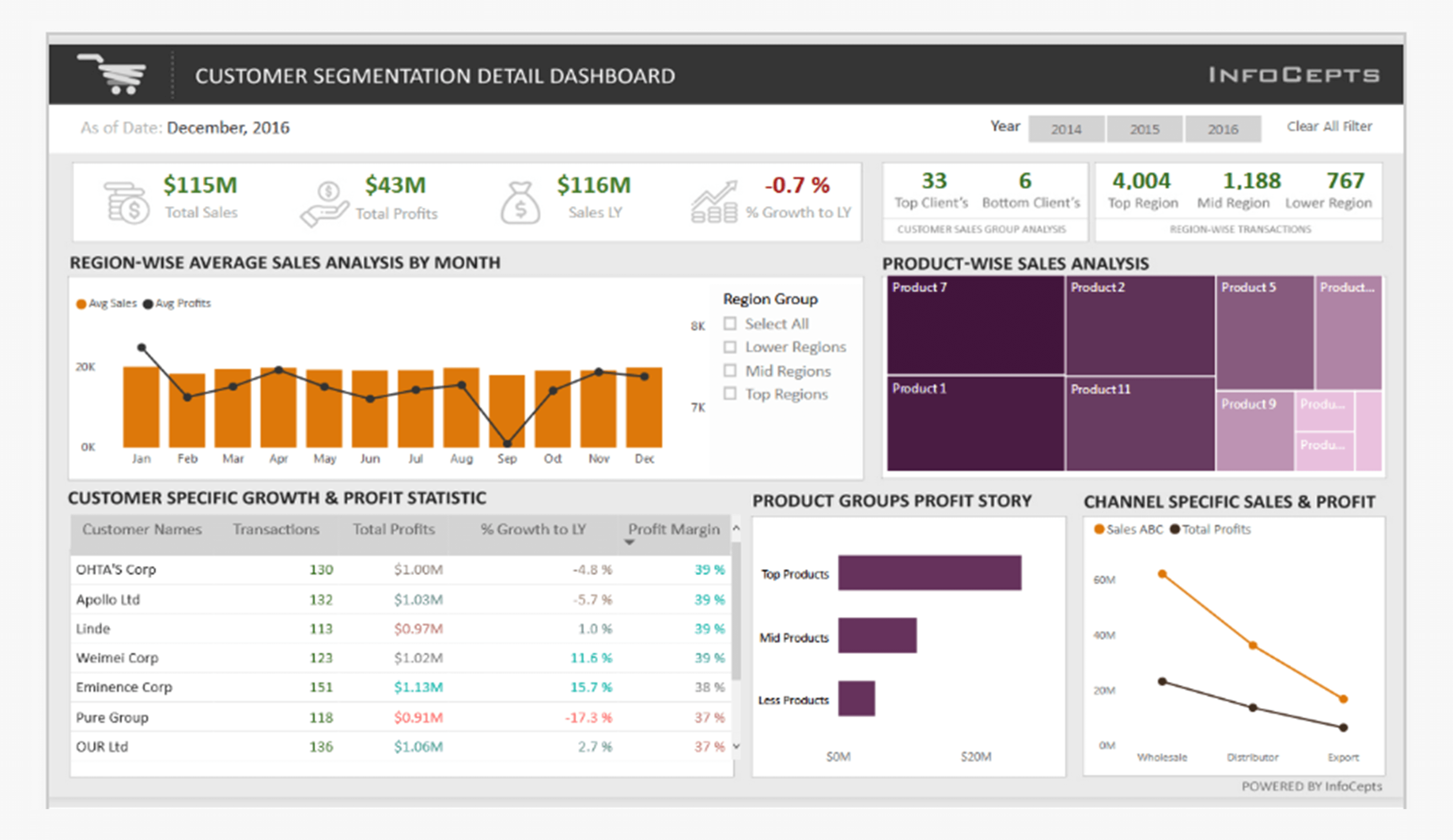
B: Sales/Marketing
The dashboard helps understand “why things are happening” from a customer segmentation standpoint:
- Visuals show results by different categories, below KPIs at the top.
- Filter allows users to interact with the dashboard to compare results by different years.
- Interaction with different visuals answers the “why” story.
Source: Power BI Data Stories Gallery


#2 - Formulate a specific question that visualisations answer
The keyword is “specific”. Let’s use an HR dashboard as an example.
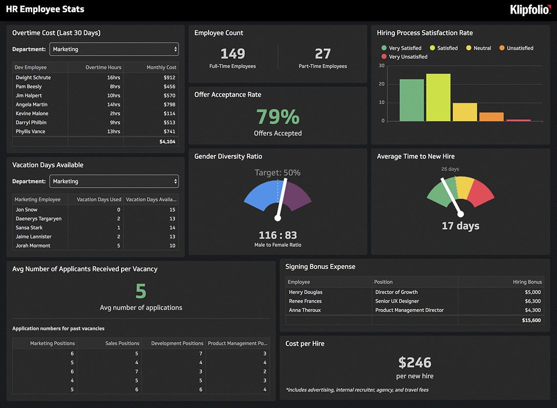
An HR dashboard that contains a visual for attrition, one on demographics, and one on performance displays a range of data, but does it answer a specific question? Not really. It’s common to see these types of dashboards, and they’re almost always created without developing the specific question in mind first.
Creating dashboards based on specific questions
Continuing to use HR as an example, here’s a list of specific questions you may want to answer along with a corresponding dashboard title. Rather than creating one cluttered dashboard, you’d create three separate dashboards.

Take a look at the dashboard images below:
Image A - Bad example - You'll see an example of a dashboard that has lots of interesting insights to look at, but they’re answering different questions. It ends up being cluttered and non-specific.
Image B - Good example - In this dashboard, all the visuals contribute towards answering a specific question “why are we experiencing high employee turnover?”
%20(1).png)

#3 - Define a consistent layout for all your enterprise dashboards
When creating a dashboard, I’d recommend creating a template so future dashboards have a consistent look and feel. It will ensure that users have the same experience when working with your enterprise dashboards. Templates should have the following components:
- Title
At the top of the screen is recommended. Think of a newspaper article - you start with the title, then the summary, and then dive into detail. Your dashboard should be structured similarly.
- Company Logo
This can be in the header and footer section. I’ve seen each approach taken at various organisations. I’d recommend working with your marketing/UX team to ensure this is consistent with other logos used in other applications in the organisation.
- Filter Pane
Top right-hand corner in the header section or the right or left-hand side below the header section and above the footer. It should be easy for the user to distinguish where it is as it’ll be used to interact with the visuals on the dashboard.
- Colour Scheme
You can often create and customise templates. Again, I’d recommend working with your marketing/UX teams to define these colour schemes.
Take a look at the dashboard images below:
Image A - Bad example - This dashboard does not have a consistent and simple layout.
- Summary (KPI's) and detailed (table) visuals are chaotic. It's not easy to read as the user is continuously shifting their focus between looking at summary and detailed visuals.
- No consistent colour and font scheme in place.
Image B - Good example - This dashboard is much better.
- Filter pane in the top right
- Company logo and title on the top left.
- Brand colour scheme and font are used.


Here are three other best practices that did not quite make the cut of our top 3 list but are extremely important as well when designing and building your dashboard:
- Reduce the clutter - limit the number of visualisations.
- Provide context.
- Choose the right visual.
If you need a bit more guidance about creating a well-designed dashboard that meets best practice and delivers the right expectations, get in touch. Our in-house training is also a great way of making sure your team are on the same page with this too.


.jpg)

.png)
%20(1).png)
.png)


