


.jpg)

%20(1).png)
%20(1).png)
%20(1)%20(1).png)


%20(1).png)
July 5, 2021
Small Multiples in Power BI: making business reports easier to understand
Small multiples, a new feature in Power BI, was released for public preview in December 2020. It tackles the cluttered chart problem by allowing you to split a visual into multiple versions of itself. You can then present these visuals side-by-side and instantly make them easier to interpret.
Solving cluttered charts
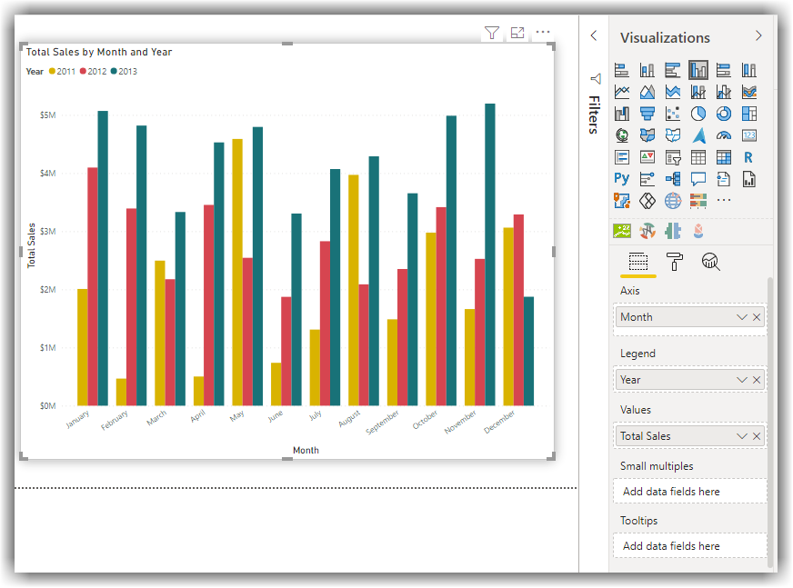
Busy, cluttered charts are a widespread problem. They commonly happen when we try to visualise too much at once on the same chart. Here's an example:
Fig 1 illustrates a regular column chart visualising Sales by Month and Year. When our cognitive process kicks in, our brains try to organise this visualisation into something that makes sense. However, with the various coloured bars and their close proximity, it's difficult for this to happen quickly.
This chart will become more complex as you add more data. For example, imagine how busy it would look if you wanted to include sales data pre-2011.
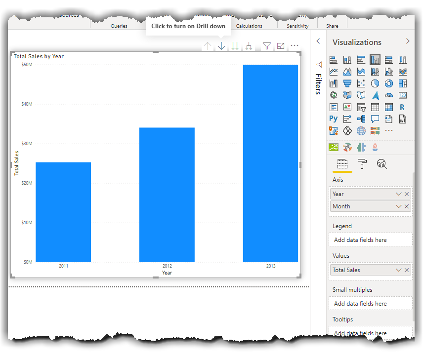
Drill-down functionality doesn't always cut it
Let's have a look at another example using the drill-down functionality. In this chart, we needed to put both Year and Month columns on the Axis, enabling the drill-down functionality (Fig 2). We needed to drill down to each Year to see the sales distribution across different months (Fig 3).
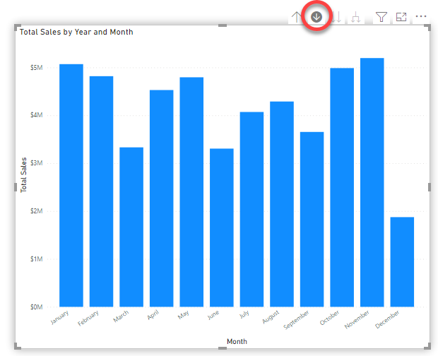
We then expanded the data from Year to Month level (Fig 4) to see the Total Sales for each month/year.
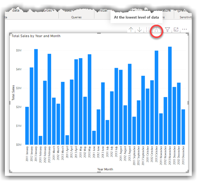
The downside to this method? As we add more data points, the number of bars increases. Eventually, the bars will be so narrow that the graph is almost impossible to read and interpret.
Here's where small multiples becomes handy!
What's the small multiples feature?
The small multiples feature lets you quickly convert a chart into multiple versions of itself. Each version of the chart shows different categories of a selected dimension.
Save time and create better charts with small multiples
Fig 5 shows how our new visualisation would look if we use the same dataset and select the small multiples feature instead. At a glance, it's simple to compare the Sales, Year and Month. Our brains are much better at interpreting patterns in space vs colour, and so naturally, it's easier to understand this new chart in Fig 5 than the chart in Fig 1.
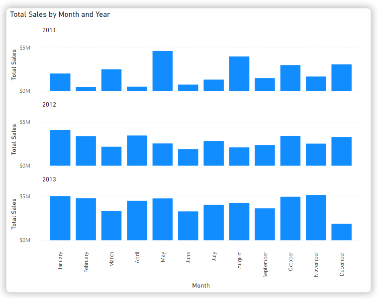
To achieve this same result without small multiples, you'd need to create multiple charts with many filters and adjust all charts on the report canvas - pretty time-consuming. Using small multiples, you get the same result with a simple drag-and-drop.
Changing the order of a chart based on Small Multiples
If you need to, follow the steps below to change the sort order of the chart based on the Small Multiples (Fig 6):
- Click the ellipsis button on the top right side of the chart
- Hover over the small multiples option
- Click the desired sorting option

How to enable the Small Multiples feature in Power BI
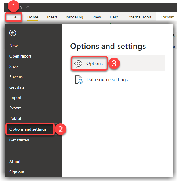
While the Small Multiples feature is in public preview, you can enable it from the Power BI Desktop Options as follows:
- In Power BI Desktop, click the File menu
- Click Options and settings
- Click Options
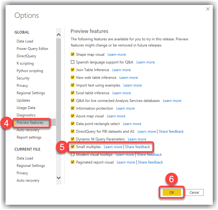
- From the Options page, click Preview features tab
- Tick the Small multiples feature
- Click OK
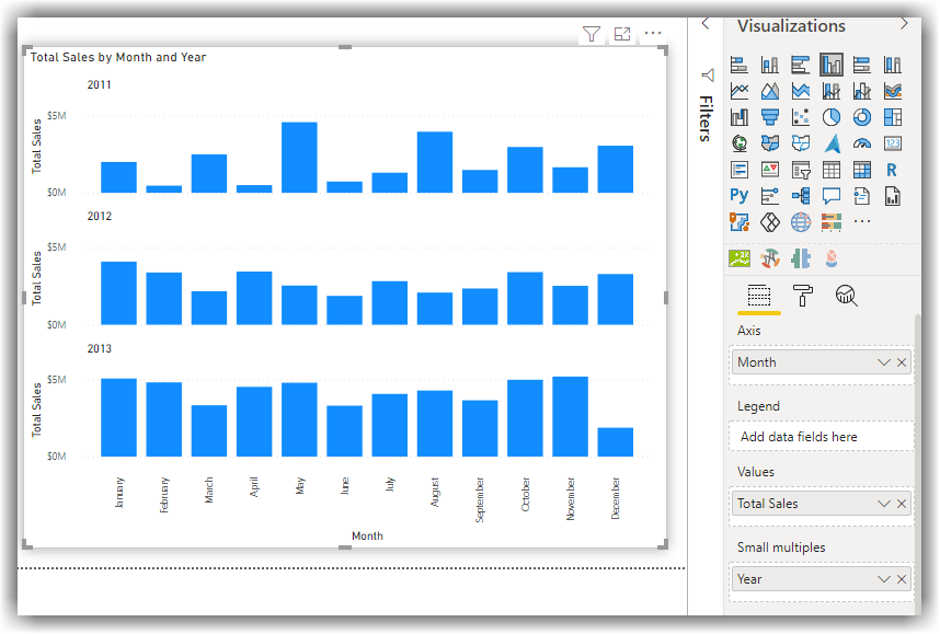
When creating your chart, you'll see a new 'small multiples' box displayed on the panel. In our example, we put the Month column on the Axis and the Year column onto the small multiples box (Fig 9).
Other examples
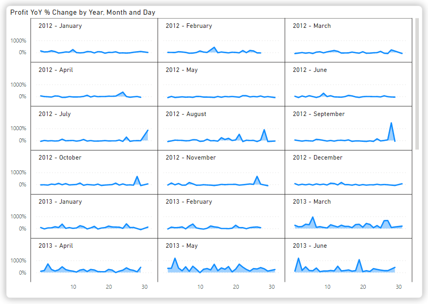
The following chart shows Profit YoY % Change by Day and Month. When we use small multiples, the number of sub-charts (small multiples) is variable, based on the existing data in our dataset. Without small multiples, it would be virtually impossible to create these kinds of charts with out-of-the-box Power BI visuals.
Try it
Using the Small Multiples feature is super easy. It can help you make compelling and comprehensive data visualisations that are easy to understand and easy to use. It's not just Year-over-Year and Monthly Sales; you can use it to analyse almost any metric over multiple dimensions, e.g. Sales by Year by Location; Profit by Product and Product Category.
Give it a go!